Guide · iPhone Duo · design rules from Apple’s sessions
iPhone Duo app development: get your app ready for Apple’s foldable, rule by rule
Apple published five sessions on getting apps ready for iPhone Duo: the overview, the design principles, the new bars, adaptive layouts around the fold, and multiple displays with the hinge. Here is what each one asks of your app, in plain words, with Apple’s own sentences quoted and the question to put to your app at the end of every section.
Verified
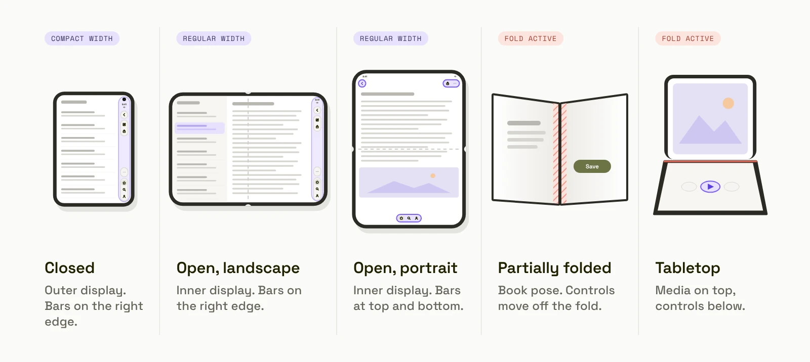
An app that runs on the iPhone Duo is not yet an app designed for it. The phone has a 5.4-inch outer display and a 7.6-inch inner display, opens like a book, stands half-open, and lets two apps sit side by side. Apple’s sessions “Prepare your app for iPhone Duo”, “Design for iPhone Duo”, “Raise the bar with iPhone Duo”, “Strike a pose with adaptive layouts on iPhone Duo” and “Leverage multiple displays and scenes on iPhone Duo” describe what that means for an app. The rules below follow the order you would review an app in.
The good news in all five sessions is the same: an app built from Apple’s own parts, that already works on iPad in both orientations, is most of the way there. The work is in what an app built its own way has to change.
How should your layout adapt to iPhone Duo?
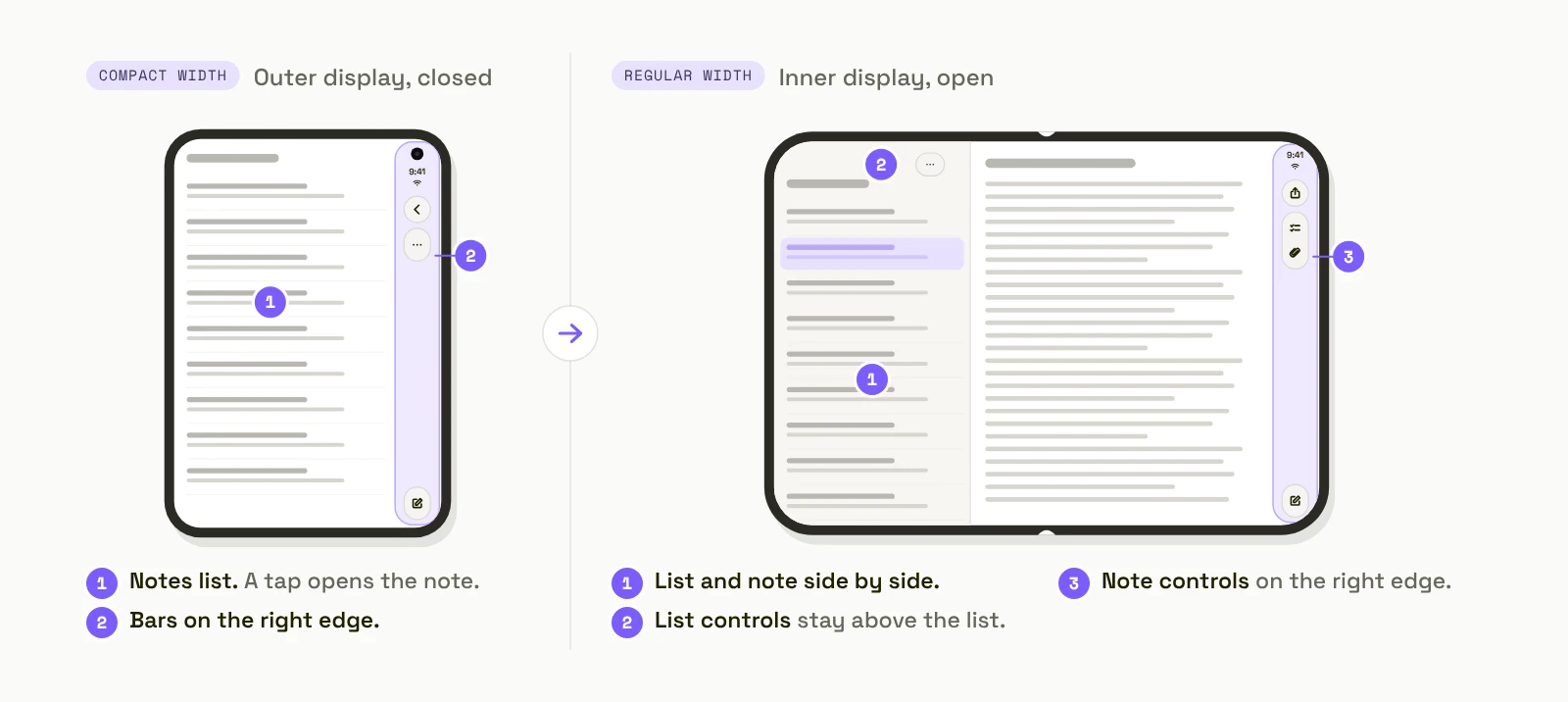
Apple’s rule. “Don’t design a custom layout for each pose, instead focus on two sizes classes: compact width on the outer display and regular width on the inner display. Avoid fixed widths, breakpoints, or any metrics tied to a specific screen.” And: “Your app should feel like a single experience adapting to the different display sizes and poses.”
What it means. The same screens, in the same hierarchy, rearranged for the space. Not a second app for the open phone. Apple is explicit about function too: “Don’t limit functionality to one pose or another. People may open and close the device frequently while using your app, so it needs to be predictable and consistent inside and out.”
Ask of your app: does any screen use a fixed width, or show a feature only when the phone is open?
For your developer: size classes, layout margins and horizontal safe-area insets; “If you’re already using these tools, you’re off to a great start.”
Do you need Xcode 27.1 and the iOS 27 SDK for iPhone Duo?
Yes, to get the Duo layout. Apple’s “Prepare your app for iPhone Duo” session describes two behaviours:
Built with an older SDK: the app runs on the inner display at “a familiar size and aspect ratio”, with space around it.
Built with the iOS 27.1 SDK in Xcode 27.1: the app can “extend to the edge of the screen”, and it gets the new bar placement and the fold-aware system components described below.
The deadline: from April 2027, apps and updates uploaded to App Store Connect must be built with the iOS 27 SDK or later, so the rebuild stops being optional. Building with a newer SDK does not change the oldest iOS version your app supports; that is a separate setting.
Ask of your app: which SDK is your current release built with, and is Xcode 27.1 beta installed on the Mac that builds it?
For your developer: Xcode 27.1 beta installs alongside the shipping Xcode; the iOS 27.1 platform is a separate download.
The current beta also needs one workaround at submission: the first archive fails. In this video, Elena Avramenko walks through building an iPhone Duo app with Xcode 27.1 beta and submitting it to the App Store, including the fix.
How do toolbars and tab bars change on iPhone Duo?
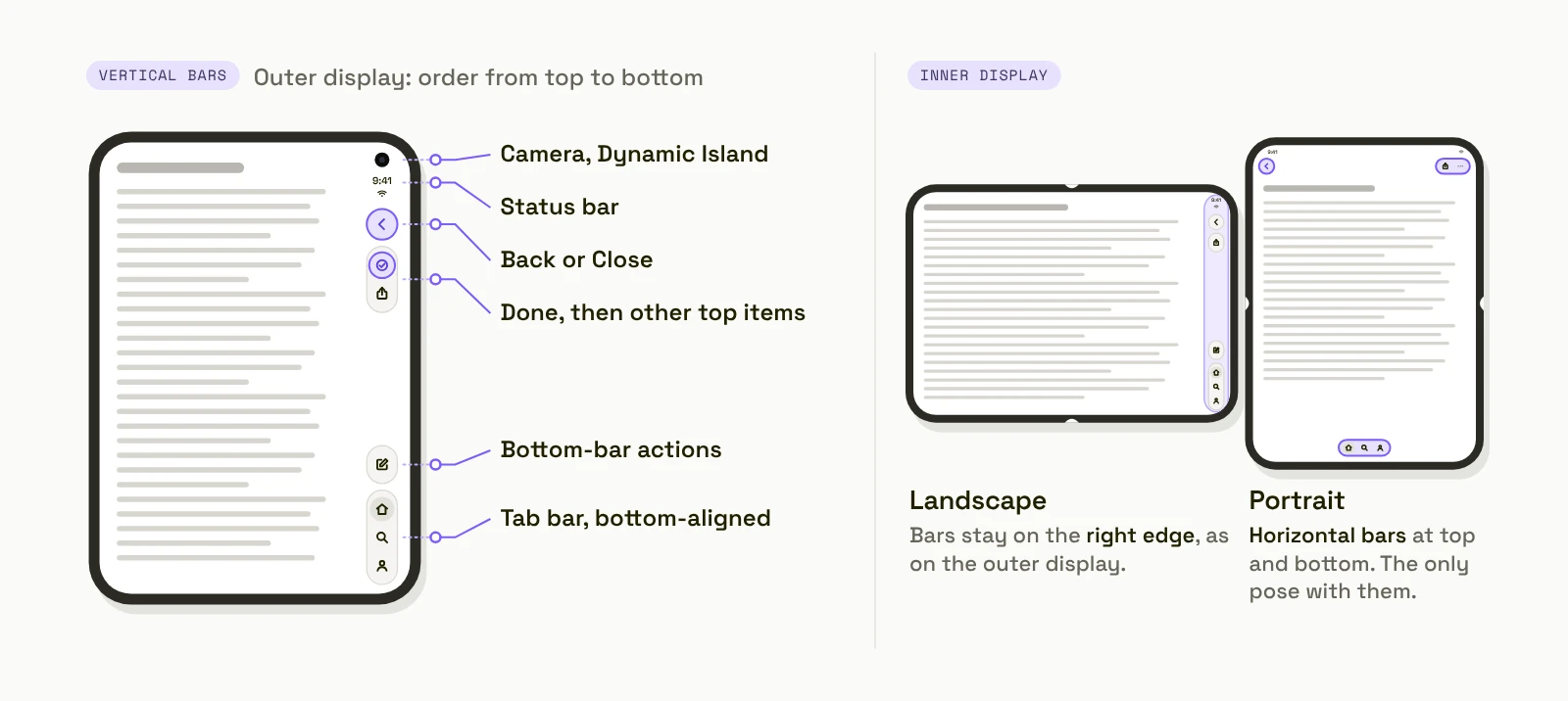
Apple’s rule. On the outer display and on the inner display in landscape, “controls that normally sit at the top and bottom, move to the side, where they’re also easier to reach.” When the phone opens in portrait, “the larger display returns to a familiar iPhone layout with horizontal bars.”
What it means for the design. Vertical bars “allow flexible item height and have a fixed width. This makes vertical bars better suited for symbol-only item representations.” Every toolbar action needs an icon as well as a title, because the system chooses which one to show. Items with icons turn to the vertical axis; text-only items stay horizontal. An action designed as a text button only will look out of place in the vertical bar.
Ask of your app: does every toolbar action have an icon? Is any bar drawn by hand instead of using the system bar?
For your developer: standard navigation, toolbar and tab views adapt automatically; custom bars do not. Labels with both an icon and a title.
Which toolbar actions stay visible on iPhone Duo?
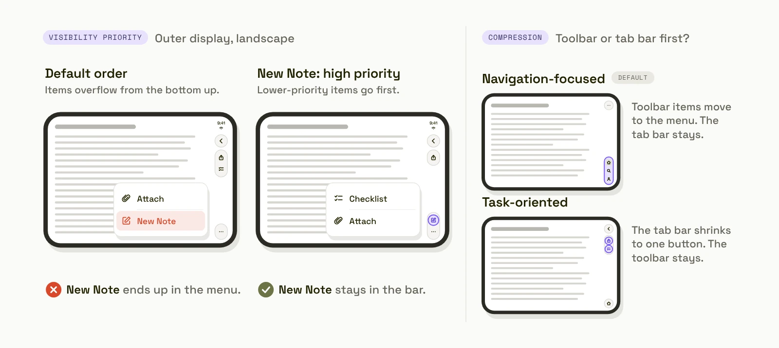
Apple’s rule. A vertical bar holds fewer items, so some move into an overflow menu. “By default, items overflow from bottom to top, but you can also assign each item a high, low, or custom priority to control the order in which they collapse.” Apple’s guidance on which: “Frequently used actions like Compose in Mail or New Note in Notes should be amongst the last to move into overflow.” Items that show status, such as badges, should stay visible longer.
Toolbar or tab bar first. “In navigation-focused experiences, like this Podcasts view, the toolbar compresses first, so primary destinations remain accessible. This is the default behavior. In task-oriented experiences, like this view from the Games app, the tab bar compresses first to preserve frequently accessed actions.”
Ask of your app: for each screen, which one action must never go into a menu, and is your app navigation-focused or task-focused?
For your developer: toolbar visibility priority per item; the compression behaviour for toolbar versus tab bar.
How do you keep controls out of the fold and the camera?
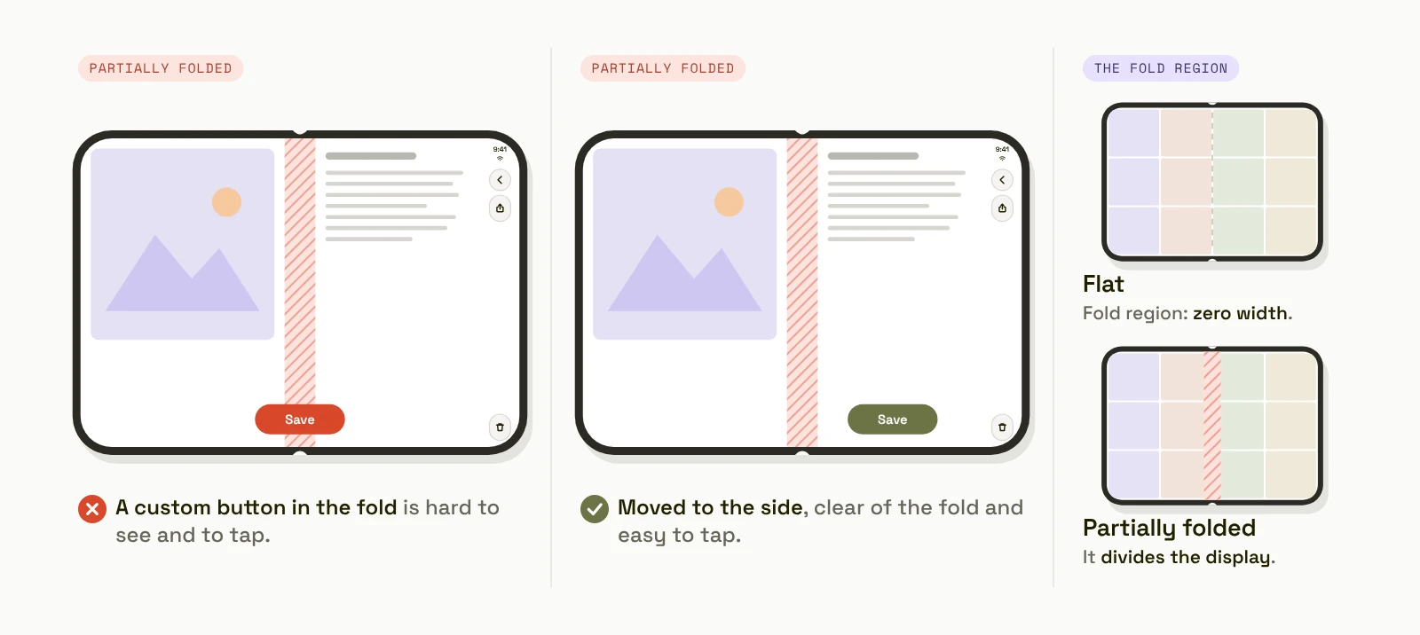
Apple’s rule. The phone has “reserved regions”: the hinge and the cameras. The fold “is only active when someone has folded the device. When flat, it’s inactive and has a width of zero.” There are two camera regions. The outer camera sits in the corner of the outer display and its region is always present. The inner camera sits under the inner display, and its region is only present while the camera is on. Apple’s design session adds the reason: “buttons are tough to tap when they land right in the fold”, so system sheets, alerts, menus and toolbar buttons are already nudged aside when the phone is partially folded.
What it means. System components handle the fold for you; custom controls do not. Check every custom button, slider and floating action button with the phone half-open.
Ask of your app: what sits in the middle of the inner display when the phone is half-open?
For your developer: reserved regions of kind division (the fold) and occlusion (the camera), queried from the view’s geometry.
Split or overlay: how should an iPhone Duo screen be arranged?
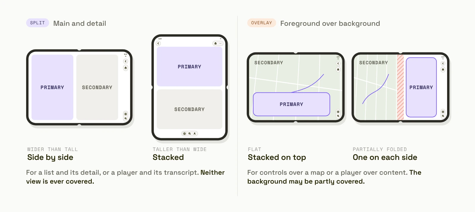
Apple’s rule. iOS 27.1 lets apps use the system’s own “arrangements”, which place two views according to the space. A split arrangement “splits its provided bounds amongst its primary and secondary view”, side by side when the view is wide and stacked when it is tall. Use it for main and detail content, where “it’s important that neither of them are ever obscured”. An overlay arrangement puts one view over another; use it when there is a foreground and a background, such as controls over readable content, where “it’s okay if it’s partially obscured at times”.
What it means. Not every screen should become two panes. A list and its detail: split. A player over a lyrics view, a map with a panel: overlay. A long article: neither, just a wider column with margins.
Ask of your app: for each screen on the open phone, is it main-and-detail, foreground-and-background, or one column?
For your developer: the system arrangement view in SwiftUI and UIKit, with split or overlay style.
What can you do with the iPhone Duo hinge?
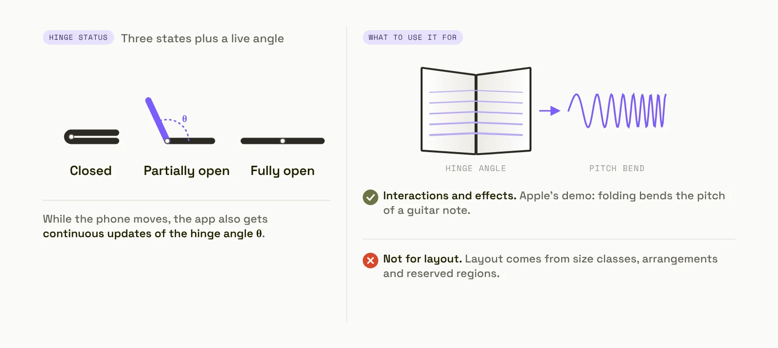
Apple’s rule. Apps can read the hinge’s status, “closed, partially open, and fully open”, and “continuous updates of the hinge angle”. Apple draws a clear line: “Hinge data is observed live, and is ideal for driving interactions or effects.” And: “For layout, use the arrangement and region APIs.”
What it means. The hinge is an input, like a slider or a gesture: a camera app that switches mode when half-open, a game that tilts, a dial set by the angle. It is not how the app decides its layout; that comes from size classes and arrangements, so it behaves the same in Split View and on an Android foldable.
Ask of your app: is there one interaction where the fold could replace a tap? If not, skip it; most apps need none.
For your developer: the hinge-change modifier in SwiftUI, the hinge interaction in UIKit.
What does iPhone Duo multitasking change for your app?
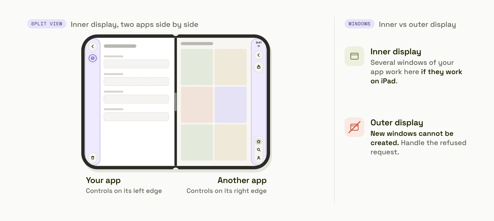
Apple’s rule. “All apps participate in multitasking on iPhone Duo, where two apps can be placed in a side-by-side layout.” So your app can be shown on half of the inner display. “iPhone Duo is the first iPhone to support multiple instances of your app’s UI. If your app supports this on iPad, it will on iPhone Duo as well.” With one difference: “On the outer display of iPhone Duo, new windows cannot be created.” Apple’s session also covers “scene accessories to present supplementary content across both displays simultaneously”.
What it means. Test the narrow width, not only the full screen. If your app opens several windows on iPad, decide what happens when someone tries that on the outer display.
Ask of your app: does every screen work at half the inner display? Does anything depend on being the only app on screen?
For your developer: handle errors when requesting new scenes; the system’s scene-activation action hides itself when new windows are not available.
What else should you review for iPhone Duo?
StandBy works “on either the outer or inner display — even when it’s not charging”, so widgets are seen more often and from further away; check they read at a glance. Apple Pencil: Apple says iPhone Duo will support it “later this year”; if your app takes handwriting on iPad, plan for it. Sheets and transitions: open a sheet, then open or close the phone; the task must continue without losing what was typed. How to make an iPhone Duo app has the build and submission steps, including the first-archive workaround the current beta needs.
The bottom line: from Apple’s rules to your app
If you own an app, iPhone Duo apps: what changes turns these rules into seven changes ranked by effort, each with the sentence to send your developer. To check the result in every pose, how to test an iPhone Duo app in every pose has the test plan. If you are starting from an idea, iPhone Duo app ideas has ten that use the fold on purpose.
With Modaal, the rules above become one line in the PRD (“every screen works in the outer and inner layouts, standard navigation and toolbars, no custom bars”), the agent builds with Xcode 27.1, and it tests each pose in the Duo simulator itself. Each feature’s logic is written once and rendered in SwiftUI on iPhone and Jetpack Compose on Android, where the same layout rules cover foldables. The Free plan covers one project with unlimited prompts on one platform; Pro is €9 per user per month billed annually (€15 monthly) and adds both platforms, TestFlight distribution and Git collaboration (/pricing).
Apple’s iPhone Duo design rules, one line each
| Area | Apple’s rule | Ask of your app | Apple session |
|---|---|---|---|
| Layout | Two size classes, no per-pose layouts, no fixed widths | Any fixed width or open-only feature? | Design for iPhone Duo |
| Hierarchy | One experience, same functions in every pose | Does anything disappear when folded? | Design for iPhone Duo |
| Bars | Bars move to the side on the outer display | Does every action have an icon? | Raise the bar |
| Overflow | Items overflow bottom to top unless prioritised | Which action must never go into a menu? | Raise the bar |
| The fold | Reserved regions: the fold and the camera | What sits in the fold when half-open? | Strike a pose |
| Arrangement | Split for main-detail, overlay for foreground-background | Which screens are which? | Strike a pose |
| Hinge | For interactions and effects, not layout | Is there one interaction worth it? | Leverage multiple displays |
| Multitasking | Every app can be shown side by side; no new windows on the outer display | Does it work at half width? | Leverage multiple displays |
Rules quoted or summarised from Apple’s iPhone Duo Tech Talks, read 4 October 2026.
Frequently asked questions
Design for two size classes (compact width on the outer display, regular width on the inner display) rather than for each pose; keep one hierarchy and the same functions in every pose; let the system move bars to the side and give every action an icon; keep custom controls out of the fold and the camera; use split or overlay arrangements; use the hinge only for interactions; and support side-by-side multitasking.
No. Apple’s design session says: “Don’t design a custom layout for each pose, instead focus on two sizes classes.” The same screens rearrange for the outer and inner displays; size classes, layout margins and safe areas do most of the work.
To keep vertical space for content on the outer display and the landscape inner display. In Apple’s words, controls that sit at the top and bottom “move to the side, where they’re also easier to reach.” Opened in portrait, the inner display returns to horizontal bars.
Only for interactions or effects. Apple: “Hinge data is observed live, and is ideal for driving interactions or effects. For layout, use the arrangement and region APIs.” Most apps need no hinge interaction at all.
It already participates: “All apps participate in multitasking on iPhone Duo, where two apps can be placed in a side-by-side layout.” Check that every screen works at half the inner display. Multiple windows of your app work on the inner display if they work on iPad, and new windows cannot be created on the outer display.
To get the Duo layout, yes. An app built with an older SDK runs on the inner display at “a familiar size and aspect ratio”; an app built with the iOS 27.1 SDK in Xcode 27.1 can “extend to the edge of the screen”, per Apple’s “Prepare your app for iPhone Duo” session. From April 2027, every upload must be built with the iOS 27 SDK or later.
No. Apple’s sessions show each new piece in both frameworks: arrangements have a UIKit view controller, reserved regions can be read from a UIKit view, and the hinge has a UIKit interaction alongside the SwiftUI modifier.
It is the best starting point. An app built from Apple’s navigation and toolbar components that works on iPad in both orientations already handles most of the inner display. The outer display’s vertical bars, the fold and the narrow multitasking width still need a check.
Native iPhone and Android apps. Start free.
One project, two native apps: Swift for iPhone, Kotlin for Android.
Keep reading
- iPhone Duo apps: what changes
Seven changes for an existing app, ranked by effort.
- How to test an iPhone Duo app in every pose
The test plan for these rules.
- How to make an iPhone Duo app
Six steps for a new app.
- iPhone Duo app ideas
Ten apps that use the fold on purpose.